Support Website
Support Website
A directory connecting disabled people in Dublin with health services and supports suited to their needs.
A directory connecting disabled people in Dublin with health services and supports suited to their needs.
A directory connecting disabled people in Dublin with health services and supports suited to their needs.
Role
Researcher & Page Design
Researcher & Page Design
Researcher & Page Design
Duration
6 weeks (2024)
6 weeks (2024)
6 weeks (2024)
Tools
Miro, FigJam, Figma
Miro, FigJam, Figma
Miro, FigJam, Figma
Collaboration
NCAD, CP-Life Research Centre, Smart Dublin, and RCSI
NCAD, CP-Life Research Centre, Smart Dublin, and RCSI
NCAD, CP-Life Research Centre, Smart Dublin, and RCSI

See the process
Why this project
Why this project
Making health services easier to find.
Making health services easier to find.
For many people with disabilities, accessing a service starts with a question: will this work for me?
That applies online too. If a website isn't accessible, finding the right health service becomes another barrier.
This project focused on both: helping people find the care they need and ensuring the website itself was accessible to use.
For many people with disabilities, accessing a service starts with a question: will this work for me?
That applies online too. If a website isn't accessible, finding the right health service becomes another barrier.
This project focused on both: helping people find the care they need and ensuring the website itself was accessible to use.


The Problem
The Problem
You can't tell if a service is right for you until you're already there, and there's nowhere to find out beforehand
You can't tell if a service is right for you until you're already there, and there's nowhere to find out beforehand
In Dublin there is no one place to find services suited to specific needs, instead of searching site by site.
People with disabilities need to find services suited to their specific needs, transport options, accessible entrances, suitable parking, and right now that information is difficult to find before arriving.
Information exists, scattered across individual service websites, but nowhere brings it together in one place built around the questions that actually matter before someone travels.
In Dublin there is no one place to find services suited to specific needs, instead of searching site by site.
People with disabilities need to find services suited to their specific needs, transport options, accessible entrances, suitable parking, and right now that information is difficult to find before arriving.
Information exists, scattered across individual service websites, but nowhere brings it together in one place built around the questions that actually matter before someone travels.
Dublin has no service to support this currently.
Dublin has no service to support this currently.
This kind of service exists elsewhere. AccessAble and Euan's Guide do this for the UK. Jaccede.com does this for France.
This kind of service exists elsewhere. AccessAble and Euan's Guide do this for the UK. Jaccede.com does this for France.
Existing Examples
Research
Research
Three existing services, tested the same way, to learn what Dublin would need to get right
Three existing services, tested the same way, to learn what Dublin would need to get right
The approach
The approach
Our team of three each tested one existing accessibility-focused service against the same two benchmarks: Nielsen Norman heuristics and WCAG accessibility principles.
Me: AccessAble (UK)
Stephen: Euan's Guide (UK)
Nathan: Jaccede.com (France)
Our team of three each tested one existing accessibility-focused service against the same two benchmarks: Nielsen Norman heuristics and WCAG accessibility principles.
Me: AccessAble (UK)
Stephen: Euan's Guide (UK)
Nathan: Jaccede.com (France)


Key Findings
Key Findings
Our combined findings, across all three
Information barrier.
The information existed, but it took several clicks too many to reach. A user shouldn't have to dig to find out if a place suits their needs.
The information existed, but it took several clicks too many to reach. A user shouldn't have to dig to find out if a place suits their needs.
Keyboard navigation.
Some people with disabilities are unable to use a mouse to navigate a website, so an assessable website needs keyboard navigation.
Some people with disabilities are unable to use a mouse to navigate a website, so an assessable website needs keyboard navigation.
Simplicity wins.
More features meant more steps. For users with cognitive or motor disabilities, every extra step increases the risk of abandonment. The lesson was to simplify features.
More features meant more steps. For users with cognitive or motor disabilities, every extra step increases the risk of abandonment. The lesson was to simplify features.
Don't duplicate, support.
Most users already have their own accessibility tools set up, screen readers, magnification, voice control. The site needs to work with these, not replace them.
Most users already have their own accessibility tools set up, screen readers, magnification, voice control. The site needs to work with these, not replace them.
Development
Development
The Build
The Build
Built around the moment of uncertainty itself: can I actually get there, and will it work for me
Built around the moment of uncertainty itself: can I actually get there, and will it work for me
For designing the website I was on a team with Anthony Mohun and Ganiyu. The whole site was built responsively, so it works just as well checked on the go as it does planned ahead of time at home.
I designed four pages, each one answers a specific part of the problem above.
For designing the website I was on a team with Anthony Mohun and Ganiyu. The whole site was built responsively, so it works just as well checked on the go as it does planned ahead of time at home.
I designed four pages, each one answers a specific part of the problem above.
What I Designed
What I Designed
Selected Categories: making filtering impossible to miss
Selected Categories: making filtering impossible to miss
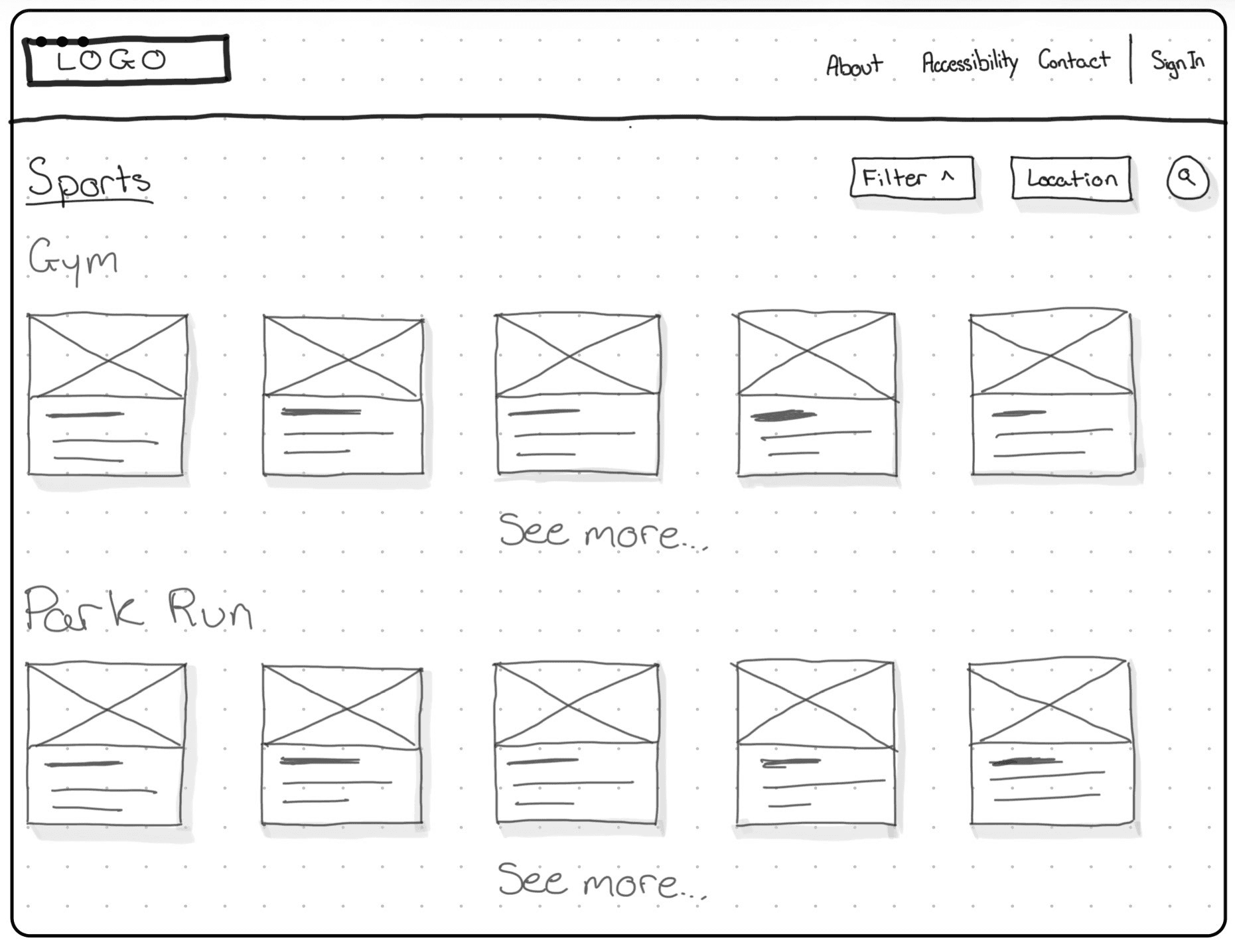
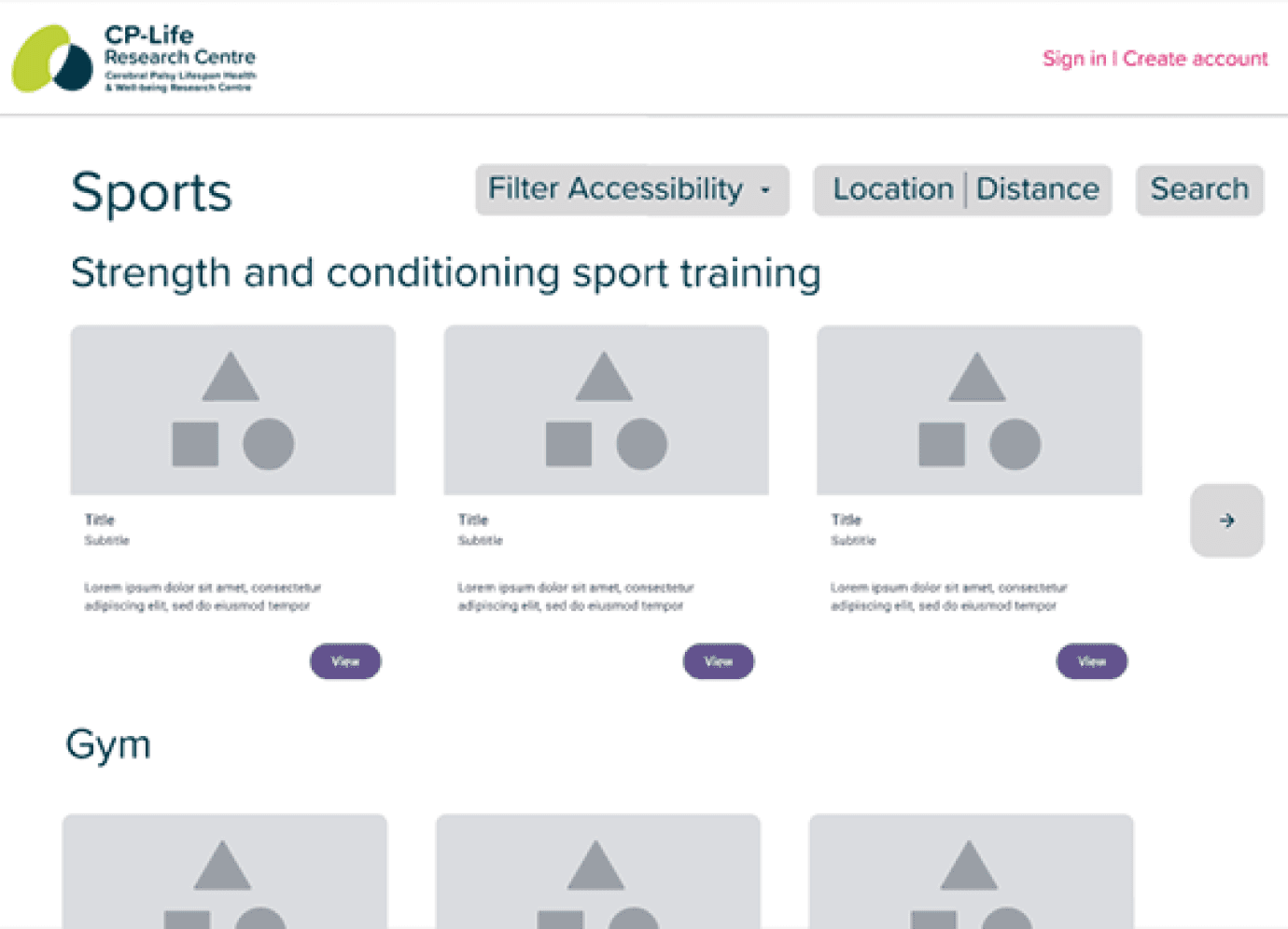
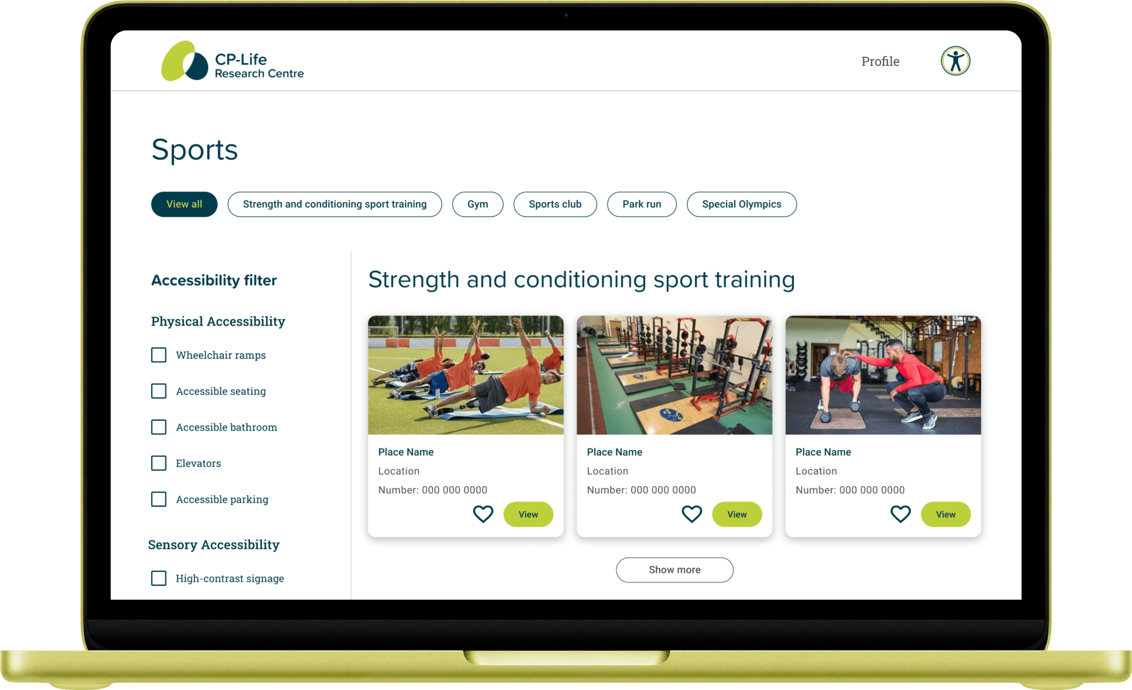
The early sketch placed filtering beside another button, easy to miss, one option among several. By the final prototype stage, I moved filtering to the forefront of the page.
That mattered it was how someone found a service that actually suited their needs, by accessibility, by service type, by what mattered to them specifically. Burying it behind a secondary button goes against the key insights from the research section.
The early sketch placed filtering beside another button, easy to miss, one option among several. By the final prototype stage, I moved filtering to the forefront of the page.
That mattered it was how someone found a service that actually suited their needs, by accessibility, by service type, by what mattered to them specifically. Burying it behind a secondary button goes against the key insights from the research section.

Selected Place: prioritising information
Selected Place: prioritising information
Contact details sit at the top of the page, not below a scroll of general information. If someone needs to call ahead and check something specific, that shouldn't take longer to find than the directions.
Contact details sit at the top of the page, not below a scroll of general information. If someone needs to call ahead and check something specific, that shouldn't take longer to find than the directions.

Reviews: a clearer signal than a star rating
Reviews: a clearer signal than a star rating
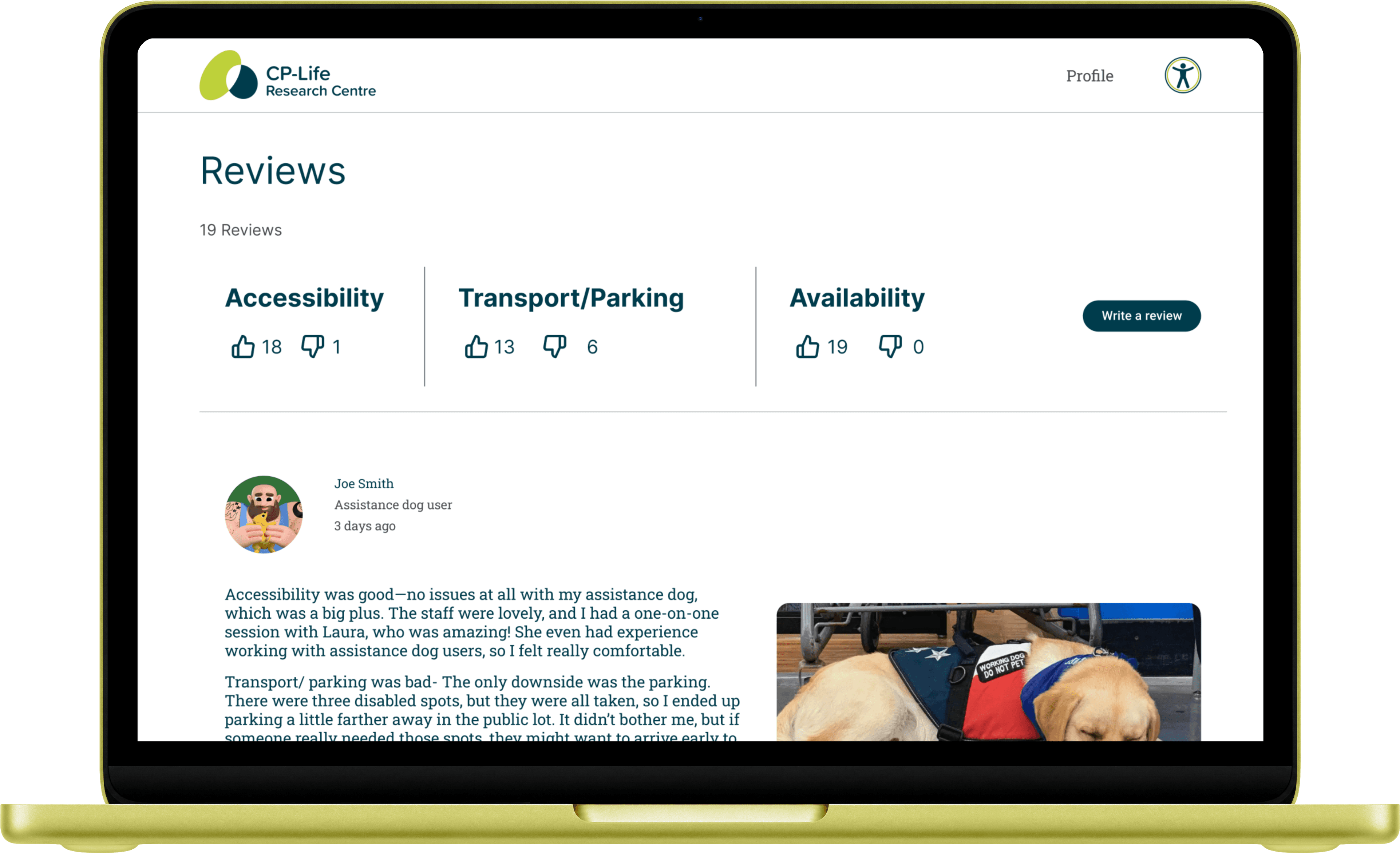
Instead of a star system, reviews use a thumbs up or thumbs down against specific categories, transport, parking, accessibility. A star rating is subjective, a four out of five doesn't tell anyone what was actually good or bad about it. A clear yes or no on "was parking accessible" does.
Instead of a star system, reviews use a thumbs up or thumbs down against specific categories, transport, parking, accessibility. A star rating is subjective, a four out of five doesn't tell anyone what was actually good or bad about it. A clear yes or no on "was parking accessible" does.
Built for keyboard use, throughout
Many people with motor disabilities can't reliably use a trackpad or mouse. Since none of the three services we tested handled this well, I built tab order and visibility into all four pages from the first wireframe, nothing a user needs ever hides behind a hover state.
Many people with motor disabilities can't reliably use a trackpad or mouse. Since none of the three services we tested handled this well, I built tab order and visibility into all four pages from the first wireframe, nothing a user needs ever hides behind a hover state.
Handoff
Handoff
Built ready for development, not just for presentation
Built ready for development, not just for presentation
Pages were prepared in Figma's dev mode, with structure and accessibility considerations documented for whoever builds this next.
Pages were prepared in Figma's dev mode, with structure and accessibility considerations documented for whoever builds this next.

Outcome
Outcome
Presented to CP-Life, Smart Dublin, and developers on the project.
Presented to CP-Life, Smart Dublin, and developers on the project.
The Selected Categories, Selected Place, and the Reviews pages were well received. Feedback was positive on the filtering redesign, the contact-first layout, and the category-based review system as a clearer alternative to star ratings.
A diagnosis takes 18 months through the public system. Private assessment is faster, but not affordable for most families.
Accessing a SpLD school requires additional psychological testing to qualify for one of the few places in classes.
Schools rarely have a psychologist on hand to test, so parents if they can afford it pay out of pocket.
The idea that needed more than I had time for.
The idea that needed more than I had time for.
On the Write a Review page, I designed for a gap: people who struggle to type or voice-record were left with no easy way to leave feedback at all. My answer was predictive text, suggested review phrasing a user could select instead of writing from scratch.
Developers were positive and could see the value in it.
A diagnosis takes 18 months through the public system. Private assessment is faster, but not affordable for most families.
Accessing a SpLD school requires additional psychological testing to qualify for one of the few places in classes.
Schools rarely have a psychologist on hand to test, so parents if they can afford it pay out of pocket.
The idea that needed more than I had time for.
The idea that needed more than I had time for.
Predicting what someone wants to say is harder than it looks
It would need serious usability testing before implementation
Getting it wrong risks feeling patronising rather than helpful
This stayed a documented direction rather than a shipped feature, the timeline didn't allow for the testing it needed.
A diagnosis takes 18 months through the public system. Private assessment is faster, but not affordable for most families.
Accessing a SpLD school requires additional psychological testing to qualify for one of the few places in classes.
Schools rarely have a psychologist on hand to test, so parents if they can afford it pay out of pocket.
Key Learnings
Key Learnings
Three Concepts, One Real Problem
Accessibility from the start. Designing against WCAG principles from the first wireframe, not retrofitting later, shaped decisions like keyboard navigation and visible focus states.
Talk to developers early. Developer feedback showed me some features need more testing time before they're trustworthy to use.
Know your user before you design. Understanding your users needs and goals is one of the most important part of the design process.
Accessibility from the start. Designing against WCAG principles from the first wireframe, not retrofitting later, shaped decisions like keyboard navigation and visible focus states.
Talk to developers early. Developer feedback showed me some features need more testing time before they're trustworthy to use.
Know your user before you design. Understanding your users needs and goals is one of the most important part of the design process.
MORE PROJECTS

